Let's build
awesome sh*t
together…
We design strategic marketing programs and brand experiences for early stage brands and corporate innovation projects.
Clients
We’re proud of our friends
Services
CMO, lead strategist, creative advisor, or marketing mercenary
Developing unique messaging, defensible market position, and innovative go-to-market frameworks for new brands and products
Creating processes for branded copy and content that highlight creativity, originality, and strengths
Designing IRL and virtual campaigns and experiences that share your brand story with target audiences, influencers, and media outlets
Concepting, writing, producing, and placing branded assets that clearly position and creatively express your brand
Ensuring that every opportunity to tell your story is clearly presented and understood for media, industry, and investors
Insights
Bringing the voice of the user to the product development process through qualitative and quantitative pressure testing
Work
A wide range of organizations, teams, budgets, and verticals
Silk Labs
Silk Labs needed to launch their AI-enabled vision for a connected home future. S2 brought the Silk brand to life with strategic assets, content, events, partnerships, and venture strategy. Acquired by Apple in 2018.
visva
S2 rebranded, reworked, and reintroduced visva’s unique machine learning driven “Super Social Network” for the next generation of content creators and community and civic engagement leaders. visva matches by taking into account contextual data, intent, and sentiment, or “Vibe”.
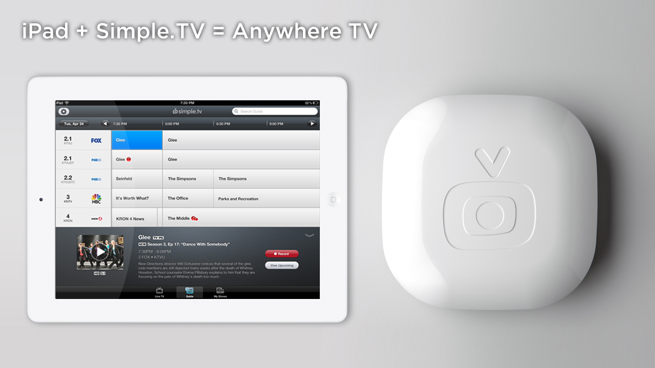
Simple.TV
S2 introduced Simple.TV, a new OTT brand in live and recorded television content, and paved the way for the world of streaming content. Won the International Consumer Electronics Show (CES) Best of Show in 2012.
LG Silicon Valley Labs
LG looked to determine market viability and launch an offshoot R&D product called Acanvas. S2 drove strategic insights, brand assets, content marketing, content partnerships, and venture fundraising in the US. Acquired by LG in 2017.
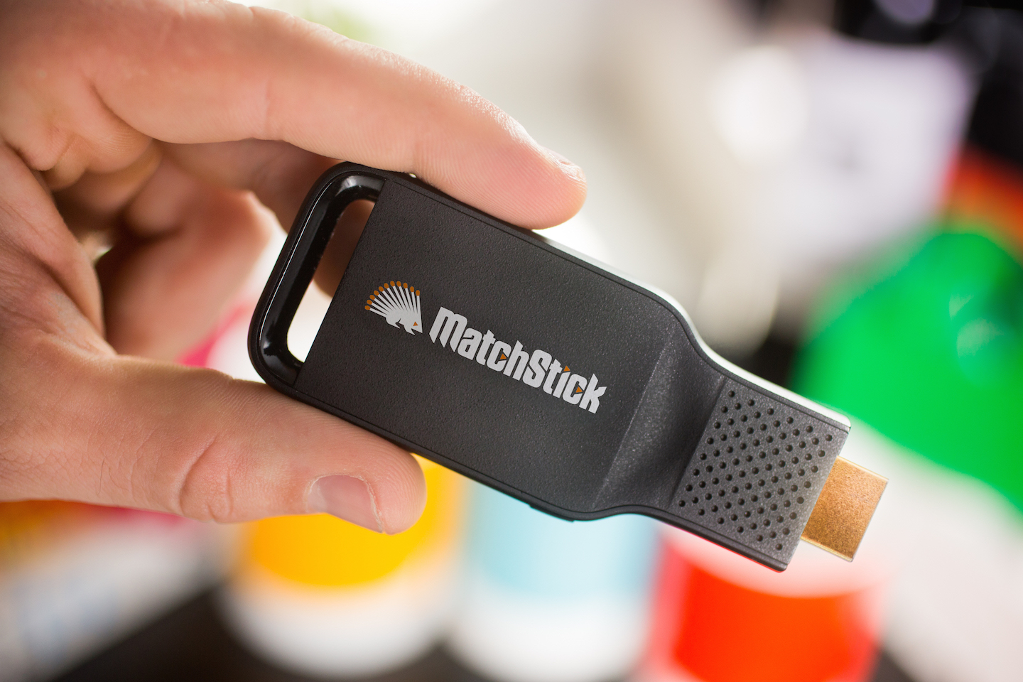
Mozilla
Mozilla aimed to unlock content around the world from regulation and distribution roadblocks. S2 created a new brand for their Firefox-powered casting platform. Demoed at Disney’s 2015 Innovation Day with a hacked version of Disney+.
SXSW Hardware House
The official consumer electronics showcase at SXSW, S2 curated and hosted featured content and product demos from such partners as Amazon, b8ta, Fast Company, Foxconn, L’Oreal, Silicon Labs, and others. Ran from 2013 - 2018.
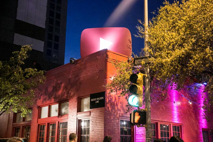
Google / YouTube
YouTube wanted to own downtown Austin during the South by Southwest Music Festival. S2 helped brand an entire building in their signature red, creating a place for musicians to gather, perform, and interact with YouTube services. 2014 to 2018.
Process
Full stack and agile marketing. Applied. Trust the process!
Onboarding & ideation
Corporate, brand, and product goals dictate timeline, budget, audience, and expectations.
Research & strategy
Inputs such as market conditions, resources, opportunities, blockers, and testing inform a solid strategy.
Onboarding & ideation
Corporate, brand, and product goals dictate timeline, budget, audience, and expectations.
Research & strategy
Inputs such as market conditions, resources, opportunities, blockers, and testing inform a solid strategy.
Execution &
evaluation
Strategic content, activations, partnerships, and progress are measured and iterated upon.
Execution &
evaluation
Strategic content, activations, partnerships, and progress are measured and iterated upon.